Dashboard
Your command center — get a quick snapshot of your store's health, team workload, and automation performance.
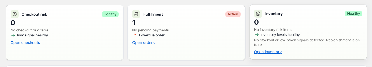
Three cards showing Checkout risk (Healthy), Fulfillment (Action — 1 overdue), and Inventory (Healthy).
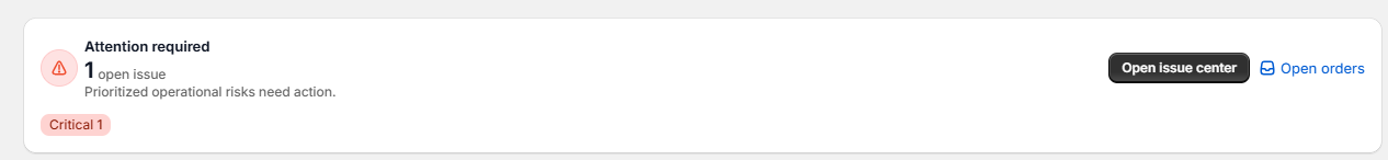
Flags critical issues: open issue count, severity badge, and quick-access "Open issue center" button.
KPI Quick Stats
At the top of the dashboard, you'll see a row of KPI cards
| KPI | What It Means |
|---|---|
| 🔔 Attention Required | Items that need your immediate action |
| 📦 Overdue Fulfillment | Orders that should have been fulfilled but haven't |
| 🛒 Abandoned Checkouts | Customers who didn't complete their purchase |
| 💰 Pending Payment | Orders with payment still pending |
| 🚫 Out of Stock | Products completely out of stock |
| ⚠️ Low Inventory | Products running low on stock |
Each card has an icon, count, colored badge (green "Healthy" or red "Action"), detail lines, and a quick-action link.
Task Overview
| Metric | What It Means |
|---|---|
| Open Tasks | Total tasks not yet completed |
| Overdue Tasks | Tasks past their due date (shown in red) |
| Due Today | Tasks that need to be completed today |
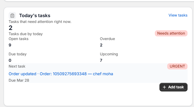
Shows due-today count with "Needs attention" badge, stats grid (Open/Overdue/Due today/Upcoming), next urgent task preview, and "+ Add task" button.
Automation Impact
See how much work your workflows are doing for you:
| Metric | What It Means |
|---|---|
| Tasks Created by Automation | How many tasks were auto-created by workflows |
| Time Saved | Estimated hours saved by automation |
| Success Rate | Percentage of workflow runs that completed successfully |
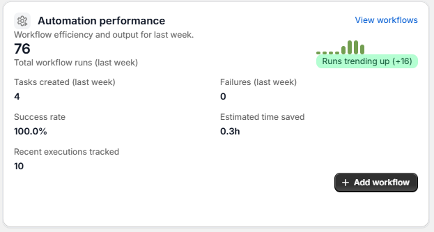
76 total workflow runs with green trend spark (+16), 100% success rate, 4 tasks created, 0.3h saved. Links to "View workflows" and "+ Add workflow".
Charts
The dashboard includes visual charts to help you understand patterns:
Task Charts
- Task Priority Distribution — Bar chart showing Low, Medium, High, and Urgent tasks
- Task Status Breakdown — How many tasks are in each status
- Staff Workload — How many tasks each team member has assigned
- Completion Rate — Donut chart showing completed vs. open tasks
Workflow Charts
- 7-Day Workflow Trends — Daily success vs. failure chart
- Workflow Success Rate — Overall success rate over time
- Failure Trends — Spot if a workflow is failing repeatedly
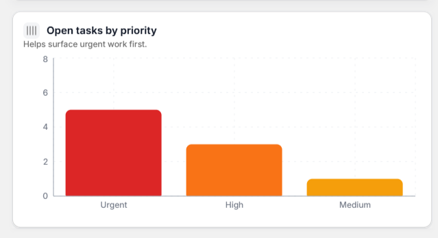
Bar chart sorted by severity — Urgent (red, tallest), High (orange), Medium (yellow). Helps surface urgent work first.
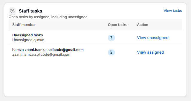
Table showing open task count per team member and the unassigned queue, with quick action links.
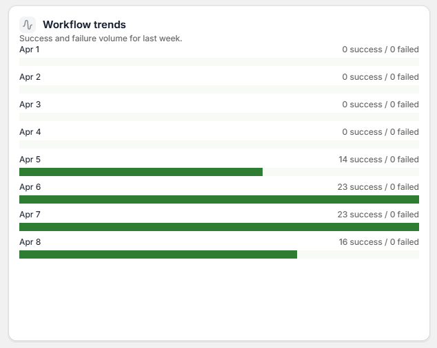
Daily success vs. failure bars from Apr 1–8 showing workflow execution volume ramping up.
Recent Activity
The Recent Activity feed at the bottom of the dashboard shows the latest team and automation events in real time.
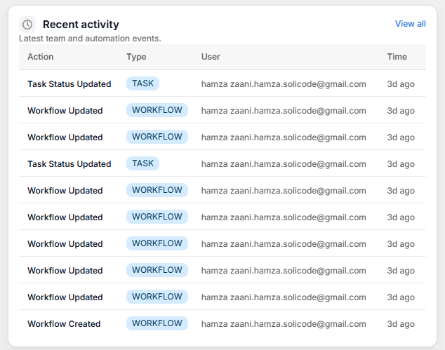
Each row logs an action (task status update, workflow created), the user, and the time. Click "View all" for full history.
Upcoming Scheduled Workflows
See which scheduled workflows are queued to run next, along with their current status.

Clickable workflow names with "Active" badges. "View all" link to manage all scheduled workflows.
Changing the Date Range
By default, the dashboard shows data from the last 7 days. To change this:

Snapshot of key metrics for the selected date range. Shows active workflows, open tasks, automation runs, and last update timestamp.